Popular posts from this blog
Understanding And Interpreting Gain And Lift Charts
Lift and Gain Charts are a useful way of visualizing how good a predictive model is. In SPSS, a typical gain chart appears as follows: In today's post, we will attempt to understand the logic behind generating a gain chart and then discuss how gain and lift charts are interpreted. To do this, we will use the example of a direct mailing company. Let us assume that based on experience, the company knows that the average response rate on its direct mail campaigns is 10%. Let us further make the following assumptions: * Cost per ad mailed = $1 * Return per response = $50 Additionally, let us assume that the company mails out ads in lots of 10,000. Based on these assumptions, if the company mails out 100,000 ads, a table summarizing the results it would obtain from this campaign is provided below: Now let us assume that the company uses SPSS Modeler to develop a predictive model using data from previous campaigns. "Response / No Response" is identified as the ...
Creating a time series forecast using IBM SPSS Modeler
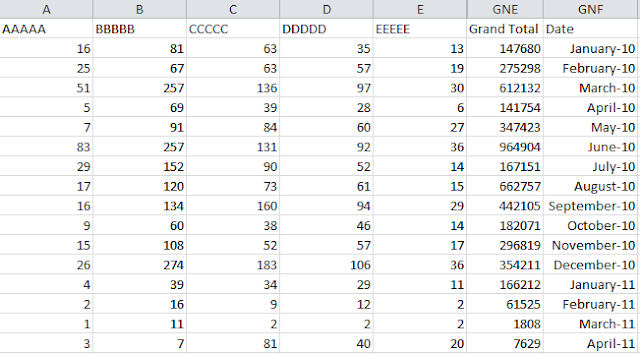
In today's post, we discuss how to create a time series forecast using IBM SPSS Modeler. For the purposes of our exercise, we will use historical sales data at a SKU (stock keeping unit) level. This data is provided in a MicroSoft Excel .xlsx file and must be in the following format: In the image above, AAAAA through EEEEE are SKU numbers with the relevant monthly sales data provided in the respective columns. There is also a column that indicates the grand total of all SKUs sold in a month (AAAAA +...+ EEEEE + other SKUs not shown in the image above). The last column in the image above reflects the months for which historical sales data are provided. As with any modeling exercise, we first insert a source node into the modeling canvas. Since our data is in the MicroSoft Excel .xlsx file format, we insert an Excel source node as follows: On exporting to a Table node, we see the output display as follows: We then add a Filter node to select t...


Hello Venky Rao,
ReplyDeleteI am connecting on my iPad. Cannot seem to open your link on forecasting.
Video blog.Thanks.please let me know.
Best
Hi, thanks for letting me know. I seem to have the same issue with iphone and ipad. I will let you know as soon as I fix the issue. In the meantime, please know that it works on my PC (Chrome and Internet Explorer).
DeleteAs my understanding all the time series have trend.It As trend component covers the rate of changes it could be increasing, decreasing or neither decreasing nor decreasing.
ReplyDeleteThanks for your comment Binu. For the purposes of the overview, I am referring to a trend as being a "persistent" movement in either the up or the down direction.
Delete