Posts

Showing posts from 2017

Visualization of the 1854 London Cholera Outbreak

This post attempts to visualize the 1854 London Cholera Outbreak based on data collected by Dr. John Snow and provided in the HistData R package. Dr. Snow was able to identify that cholera was a water borne disease by visualizing his data in 1854 and was able to bring the Cholera outbreak to an end. This dataset and analysis speaks to power of geospatial data and its importance in decision making.

What caused the Challenger disaster?

The motivation for this blog is to examine the reasons behind the explosion of the USA Space Shuttle Challenger on 28 January, 1986. The night before the launch a decision had to be made regarding launch safety and engineers recommended that the launch be postponed in the event the temperature at launch was below freezing as this adversely impacted the integrity of O-rings, a key component holding in field joints. The engineers advice was ignored and disaster ensued. Let's dive in!

Regression in R

M y  latest publicly available R notebook  created in  IBM's Data Science Experience  is  here !  This notebook provides a tutorial on: This notebook covers: Fitting and interpreting linear models ; Evaluating model assumptions; and Selecting among competing models. I hope you enjoy this  notebook .  Please feel free to share and let me know your thoughts. My latest notebook: Regression in R https://t.co/HDYFzTAFPr #rstats #DataScience #ibmaot #Statistics #Stats #dsx #Bluemix h/t @kabacoff pic.twitter.com/LxKc9HkBC0 — Venky Rao (@VRaoRao) October 15, 2017

Coefficient of Alienation

Image
If you thought the coefficient of alienation referred to the hostility I receive from my family as I update my blog on a Saturday afternoon, I would not fault you too much.  However, this is a blog about predictive analytics which is based on Statistics.  So let's keep that in mind as we understand what the "Coefficient of Alienation" means. Apart from being one of the coolest sounding Statistical terms, the Coefficient of Alienation measures the proportion of variation in the outcome not “explained” by the variables on the right-hand side of a simple linear regression (ordinary least squares) equation. The Coefficient of Alienation is also known as the Coefficient of Non-Determination since the formula for calculating it is: where: is the Coefficient of Determination. And now before my personal (and non-Statistical) Coefficient of Alienation reaches the point of no return, I will bring this post to an end.

Homoscedasticity and heteroscedasticity

Image
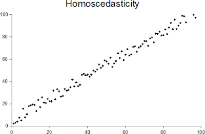
Homoscedasticity and heteroscedasticity - two of the scariest sounding terms in all of Statistics!  So what do they mean? When one calculates the variance or standard deviation of a dataset of random variables, one assumes that the variance is constant across the entire population.  This assumption is homoscedasticity.  The opposite of this assumption is heteroscedasticity. In other words, a collection of random variables is heteroscedastic if there are sub-populations within the dataset that have different variances from others (source: https://en.wikipedia.org/wiki/Heteroscedasticity).  Another way of describing homoscedasticity is constant variance and another way of describing heteroscedasticity is variable variance. Jeremy J Taylor  in his blog  provides a great example of a distribution that is heteroscedastic.  In his example, the independent variable is "age" and the predictor variable is "income".  The example discusses how incomes

Standard Deviation versus Absolute Mean Deviation

Image
One of the first things that any student of statistics learns is 2 popular measures of descriptive statistics: mean and standard deviation. Has the approach to calculating Standard Deviation ever got you wondering about the need to square the distances from the mean in order to remove negatives instead of just using the average of the absolute values to eliminate negatives?  Well, you are certainly not alone. As it turns out, squaring the distances from the mean and then calculating their square root to arrive at the Standard Deviation of a distribution is more as a result of convention than anything else.  In fact, there is a measure called the Absolute Mean Deviation that does not take the squared distances from the mean to eliminate negative values.  Instead, it just takes the absolute values of the differences from the mean and calculates the average of the sum of those values to determine deviation from the mean. The convention of course is to use Standard Devia

Basic Statistics in R

M y  latest publicly available R notebook  created in  IBM's Data Science Experience  is  here !  This notebook provides a tutorial on: This notebook covers: Descriptive statistics Frequency and contingency tables Correlations and covariances t-tests; and Nonparametric statistics. I hope you enjoy this  notebook .  Please feel free to share and let me know your thoughts. My latest R notebook: Basic #Statistics in R https://t.co/b3NmhNXI5X #DataScience #dsx #IBM #Bluemix #ibmaot #rstats h/t @kabacoff pic.twitter.com/AsIhr51Q5l — Venky Rao (@VRaoRao) September 13, 2017

Adding a .RData file to DSX in 5 easy steps

I created a tutorial to show how users can add a .RData file to an R Jupyter Notebook in IBM's Data Science Experience (DSX) in 5 easy steps. My latest #R #notebook : Add a .RData file to a DSX R Notebook in 5 steps https://t.co/uznXwZWKSv #dsx #IBM #DataScience #rstats #ibmaot pic.twitter.com/plKuTwYDwt — Venky Rao (@VRaoRao) September 13, 2017

Basic graphs in R

M y  latest publicly available R notebook  created in  IBM's Data Science Experience  is  here !  This notebook provides a tutorial on: Bar, box and dot plots Pie and fan charts Histograms and kernel density plots. I hope you enjoy this  notebook .  Please feel free to share and let me know your thoughts. My latest #R #notebook : Basic Graphs in R https://t.co/o7j97GwEUL #DataScience #dsx #IBM #ibmaot h/t @kabacoff pic.twitter.com/MBfZQgg4Y0 — Venky Rao (@VRaoRao) September 4, 2017

Advanced Data Preparation in R

M y  latest publicly available R notebook  created in  IBM's Data Science Experience  is  here !  This notebook addresses some advanced features available in R focusing on Data Preparation. I hope you enjoy this  notebook .  Please feel free to share and let me know your thoughts. My latest #R #notebook : Advanced Data Preparation in R https://t.co/7Dvc9nCPK0 #DataScience #dsx #ibmaot #IBM h/t @kabacoff pic.twitter.com/cNpP45vpoR — Venky Rao (@VRaoRao) September 2, 2017

Engine bleed air: a primer

Image
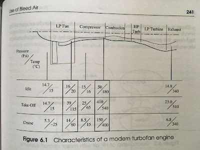
Use of Bleed Air in Aircraft Pneumatic Systems: A Primer ( taken from Chapter 6 on Pneumatic Systems from the 3 rd Edition of the book “Aircraft Systems” by Ian Moir and Allan Seabridge ) The use of aircraft engines as a source of high pressure, high temperature air can be understood by examining the characteristics of the turbofan engine.   Modern engines “bypass” a significant portion of the mass flow past the engine and increasingly a small portion of the mass flow passes through the engine core or gas generation section.   The ratio of bypass air to engine core air is called the bypass ratio and this can easily exceed 10:1 for the very latest civil engines; much higher than the 4 or 5:1 ratio for the previous generation. The characteristics of a modern turbofan engine are shown in figure 6.1.   This shows the pressure (in psi) and the temperature (in degree centigrade) at various points throughout the engine for three conditions: ground idle, take off power and

Data Preparation in R

My latest publicly available R notebook created in IBM's Data Science Experience is here !  This notebook focuses on the basics of one of the most important aspects of Data Science: Data Preparation! I hope you enjoy this notebook .  Please feel free to share and let me know your thoughts. My latest #R #notebook : Data Preparation in R https://t.co/5yXpG5DHFY #DataScience #dsx #ibmaot #IBM h/t @kabacoff pic.twitter.com/42j6hMRFaF — Venky Rao (@VRaoRao) August 24, 2017

Getting started with graphs in R

My next publicly available R notebook created in IBM's Data Science Experience is here !  This notebook helps users get started with basic graphs in R and contains general techniques that apply to all graphs in R except those created using the "ggplot2" library. While only a few lines of code are needed to create graphs in R, I have provided extensive comments for each line of code so first-time R-users can also follow along.  I hope you enjoy this notebook.  Please feel free to share and let me know your thoughts. My latest #R #notebook : Basics of #graphs in #rstats https://t.co/2CU6uGJGOF #DataScience #dataviz #dsx #ibmaot #IBM h/t @kabacoff pic.twitter.com/HdCCRxP8FG — Venky Rao (@VRaoRao) August 21, 2017

Data Structures in R

In order to help users to get started with IBM's Data Science Experience , I have started developing tutorials / cookbooks.  My preferred language for Data Science is R so all my Jupyter notebooks will use that language. My very first tutorial is on Data Structures in R.  I recently acquired the second edition of Dr. Robert Kabacoff's excellent book titled "R In Action" and have decided to create a Jupyter notebook for (almost) every chapter in the book.  Here is the first one.  I hope you enjoy it.  Please feel free to comment and let me know your thoughts. Click on this link for a quick tutorial on #Data Structures in #R : https://t.co/EsalloitG5 #rstats #ibm #dsx #ibmaot hat tip to @kabacoff pic.twitter.com/m9kDINC9CX — Venky Rao (@VRaoRao) August 11, 2017

SPSS Modeler - R Integration

Image

Earthquakes Visualized

Image
Using data from USGS (https://earthquake.usgs.gov/earthquakes/feed/v1.0/csv.php), I created a 3D web map of all earthquakes that occurred on 3 May 2017 with a magnitude > 1.0 on the Richter scale.  Here's a screenshot of my 3D web map: If you want to experience the app in all its glory, click on this link:  http://arcg.is/e19b4 If you want to stay on my awesome blog and experience the web app right here, you can do that here: I would love to hear what you think!

Time enabled web app

Image
Working with a collaborator who published a map service that showed the growth of US cities through time (from the year 1790 through 2000), I created an interactive time enabled web app. Here's a screenshot: You can explore the app right here: If however, you want to access the web app in it's own web page, go here:  http://arcg.is/2oRpgMH The web app includes widgets that let you enable time scaling as well as changing the underlying basemap.  Feel free to explore the web app and let me know what you think.

Restaurant Location Selector

Image

3D Web Scene of Earthquakes, Tornadoes, Typhoons and Cities

Image
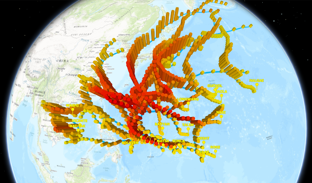
Here's my very first 3D Web Scene that visualizes natural disasters and two cities (Portland and Montreal):  http://arcg.is/01jbSq A 3D Web Scene is Esri-speak for a 3D web map.  You can zoom and pan, re-orient, change basemaps, change the daylight settings, explore different views and do lots more.  Here's a screen shot of all typhoons represented on the 3D Web Scene: In this screenshot, typhoons are represented as cylinder symbols, with greater heights representing higher wind speeds and darker colors representing lower barometric pressures. If you don't want to leave my beautiful blog (I don't blame you), you can check out the embedded version of the 3D Web Scene right here: Check it out.  I'd love to know what you think!