Understanding And Interpreting Gain And Lift Charts
Lift and Gain Charts are a useful way of visualizing how good a predictive model is. In SPSS, a typical gain chart appears as follows:

In today's post, we will attempt to understand the logic behind generating a gain chart and then discuss how gain and lift charts are interpreted.
To do this, we will use the example of a direct mailing company. Let us assume that based on experience, the company knows that the average response rate on its direct mail campaigns is 10%. Let us further make the following assumptions:
* Cost per ad mailed = $1
* Return per response = $50
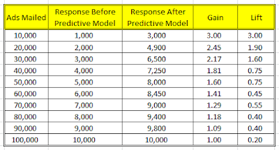
Additionally, let us assume that the company mails out ads in lots of 10,000. Based on these assumptions, if the company mails out 100,000 ads, a table summarizing the results it would obtain from this campaign is provided below:

Now let us assume that the company uses SPSS Modeler to develop a predictive model using data from previous campaigns. "Response / No Response" is identified as the "target" field and various demographic, socio-economic and behavioral variables are used as predictors. As a result of the predictive model, the company is able to sort its entire prospect list in decreasing order of expected sales. Consequently, rather than mailing out its ads to a random bunch of 10,000 prospects, the company mails out its ads to the "most likely" 10,000 first, followed by the next 10,000 and so on. Following this method, the company generates the following results table:

As can be seen, results from the second table are significantly better than those indicated in the first table. If the company were interested in maximizing returns, it would obtain a return of $400,000 by merely spending $50,000 using the predictive model whereas previously it would need to have spent $80,000! From a profit standpoint, in order to obtain a minimum profit of $360,000 while previously the company would have had to spend $90,000, using the predictive model, the company would only need to spend $60,000!
By comparing the response rate of the two campaigns, we obtain the following results:

By plotting this table on a line chart, we obtain the following result:

As can be seen from the chart above, the gap between the green line (response after predictive model) and the red line (response before predictive model) indicates the gains that the company sees from using the predictive model to prioritize its mailing list in decreasing order of expected sales rather than merely mailing out ads in a random order.
So how are gain and lift calculated? Let us define both these terms to find out:
* Gain = (Expected Response Using Predictive Model) / (Expected Response From Random Mailing)
* Lift = (Expected Response In A Specific Lot Of 10,000 Prospects Using Predictive Model) / (Expected Response In A Random Lot Of 10,000 Prospects Without Using Predictive Model)
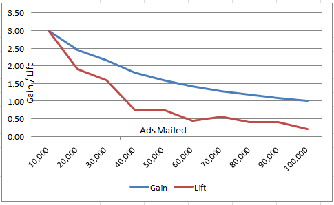
For the data used in this example, Gain and Lift is as follows:
Since we use SPSS to classify the prospect list in decreasing order of expected sales, the Gain and Lift chart is downward sloping as can be seen below:

To summarize, Gain and Lift Charts help answer the following questions:
* How good is the predictive model?
* How does the response rate of a targeted selection compare to a random selection? Gain > 1 means the results from the predictive model are better than random.
As always, comments and feedback are welcome.

In today's post, we will attempt to understand the logic behind generating a gain chart and then discuss how gain and lift charts are interpreted.
To do this, we will use the example of a direct mailing company. Let us assume that based on experience, the company knows that the average response rate on its direct mail campaigns is 10%. Let us further make the following assumptions:
* Cost per ad mailed = $1
* Return per response = $50
Additionally, let us assume that the company mails out ads in lots of 10,000. Based on these assumptions, if the company mails out 100,000 ads, a table summarizing the results it would obtain from this campaign is provided below:

Now let us assume that the company uses SPSS Modeler to develop a predictive model using data from previous campaigns. "Response / No Response" is identified as the "target" field and various demographic, socio-economic and behavioral variables are used as predictors. As a result of the predictive model, the company is able to sort its entire prospect list in decreasing order of expected sales. Consequently, rather than mailing out its ads to a random bunch of 10,000 prospects, the company mails out its ads to the "most likely" 10,000 first, followed by the next 10,000 and so on. Following this method, the company generates the following results table:

As can be seen, results from the second table are significantly better than those indicated in the first table. If the company were interested in maximizing returns, it would obtain a return of $400,000 by merely spending $50,000 using the predictive model whereas previously it would need to have spent $80,000! From a profit standpoint, in order to obtain a minimum profit of $360,000 while previously the company would have had to spend $90,000, using the predictive model, the company would only need to spend $60,000!
By comparing the response rate of the two campaigns, we obtain the following results:

By plotting this table on a line chart, we obtain the following result:

As can be seen from the chart above, the gap between the green line (response after predictive model) and the red line (response before predictive model) indicates the gains that the company sees from using the predictive model to prioritize its mailing list in decreasing order of expected sales rather than merely mailing out ads in a random order.
So how are gain and lift calculated? Let us define both these terms to find out:
* Gain = (Expected Response Using Predictive Model) / (Expected Response From Random Mailing)
* Lift = (Expected Response In A Specific Lot Of 10,000 Prospects Using Predictive Model) / (Expected Response In A Random Lot Of 10,000 Prospects Without Using Predictive Model)
For the data used in this example, Gain and Lift is as follows:

Since we use SPSS to classify the prospect list in decreasing order of expected sales, the Gain and Lift chart is downward sloping as can be seen below:
To summarize, Gain and Lift Charts help answer the following questions:
* How good is the predictive model?
* How does the response rate of a targeted selection compare to a random selection? Gain > 1 means the results from the predictive model are better than random.
As always, comments and feedback are welcome.

Excellent work in de-constructing the gains chart!
ReplyDeleteThank you realdeal2010.
ReplyDeleteExcellent explanation.
ReplyDeleteThank you.
Deletevery good and clear explanation of gains chart
ReplyDeleteThank you.
DeleteI have to express some thanks to the writer just for bailing me out of this type of difficulty. As a result of browsing through the world-wide-web and coming across proposals which are not powerful, I believed my life was done. Existing devoid of the answers to the problems you have solved through your guideline is a crucial case, and the kind which may have negatively damaged my entire career if I hadn't encountered the website. Your primary ability and kindness in taking care of every aspect was very helpful. I don't know what I would've done if I hadn't come across such a solution like this. It's possible to at this point look forward to my future. Thank you very much for the high quality and amazing guide. I won't be reluctant to suggest the blog to any person who would need guidance about this matter.
ReplyDeletemodern cast iron radiators
Awesome post. It was so informative and very organised. Are you looking for the best home elevators in India. Home elevators | lift for home
ReplyDeleteInnomatics Research Labs is collaborated with JAIN (Deemed-to-be University) and offering the Online MBA in Artificial Intelligence & Business Intelligence Program. It is a sublime program of getting an MBA degree from one of the best renowned university – JAIN University and an IBM certification program in Data Science, Artificial Intelligence, and Business Intelligence from Innomatics Research Labs in collaboration with Royal Society London.
ReplyDeleteOnline MBA in Artificial intelligence from Jain University
Thanks for sharing this article. Data have become more important than ever, everywhere! Data in Gaming Industry plays a major role in a platform's success. That being said, What do you think about its role in the gaming industry?
ReplyDeleteI think marketing automation software's will help reduce churn rate like never before. Can it be deployed like this article?
Customer Churn
Thanks for sharing this information. I really like your blog post very much. You have really shared a informative and interesting blog post with people..
ReplyDeletefull stack web development course
Understanding and interpreting gain and lift charts is crucial for evaluating the effectiveness of predictive models in data analysis. Gain charts measure the cumulative benefits of targeting specific segments, while lift charts show how much better a model performs compared to random selection. Similarly, academic success often depends on utilizing the right resources, such as online economics class takers, who provide expert guidance for mastering complex topics. Just as gain and lift charts improve decision-making in analytics, these services support students in achieving their educational goals efficiently.
ReplyDeleteGreat post on Understanding and Interpreting Gain and Lift Charts! These charts are essential for evaluating model performance, especially in targeting and predictive analytics. They make it easier to see how well a model distinguishes between outcomes and helps in decision-making. For students or professionals working with statistical tools, mastering such concepts is crucial. If anyone needs extra support, stata assignment help offers expert guidance to make statistical analysis clearer and more effective. Thanks for sharing this insightful content!
ReplyDelete